My research question for this self-generated data set is: What news did I consume in the week leading up to the 2020 presidential election? How did I access it, and from what sources? This visualization has an audience of one, as I am the only person with a confirmed interested in my news consumption patterns in this format. (That being said, I’m sure my consumption of news on these various platforms has being captured with my IP address and aggregated on a private server somewhere to inform targeted advertising and/or for sale to a third party.) I feel like I’m constantly consuming news, and that it’s become a compulsion rather than a thirst for information. While this data set in no way tackles my motivation for news consumption, it has allowed to me substantiate my concerns with some quantitative evidence. I began data collection on Friday October 23, ended data collection on Friday October 30, for a total of eight days.

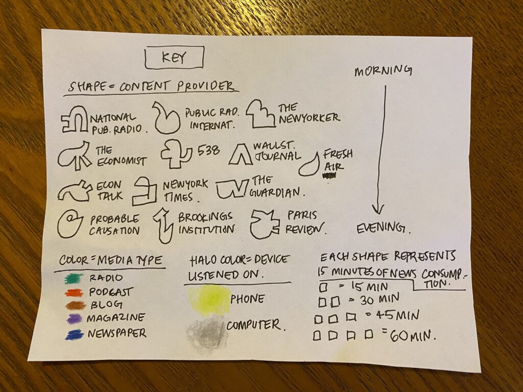
In the visualization I created each box represents a single day, for a total of eight boxes. Time in the graphic moves from the upper left to the bottom right, simulating a traditional calendar. Within each box time moves from top to bottom; the top of the box representing morning, and the bottom the evening. As you can see from the visualization, the majority of my news consumption happens in the morning, or the top portion of each box. Within each box, each unique shape represents a single content provider. The color of each shapes indicates the type of media that the content provider associated with the shape falls within: radio, podcast, blog, periodical or newspaper. The halo of color around the shapes indicates the device used to access the content. In my case, this came down to phone or computer, as I don’t have a television, and I don’t tend to read news in print. The count of shapes represents time spent consuming content from a particular media outlet. Each shape represents a 15-minute increment (e.g. a show that I listened to for 45 minutes would have 3 identical shapes, and an article I read for 15 minutes or less would just include one shape. A visual version of these details is all included in the associated key.
Inspired by the Dear Data project and accompanying videos from the authors, and influenced by the personal scale of this project, I opted to hand-draw my visualization rather than use Tableau. My original data set included the following fields for each record: date, day of week, start time, end time, media type, content provider, and show (or program, article, or section). When I began developing the shapes or symbols for each show, I realized that content provider, rather than show/title/subject, should be the highest level of granularity included in the visualization, as the show and article-level data were all unique and thus unfit for aggregate or uniform reporting. Media type had five options, which seemed like a nice number of colors for the visualization, so I opted to include media type with color. The devise used felt like the final discrete qualitative variable need, so listening devise was included like a halo that wraps around each symbol. Initially, I made the visual unique at the show/title-level and included upwards for 30 distinct symbols; I tried to use scale of symbol to indicate relative time spent with a particular show or content provider. I scrapped this idea when I realized that while scale is essential to computer-generated visuals organized on an X-Y axis, consistent scaling as one of the most difficult things to legibly execute in a hand-drawn visualization. I opted instead to use quantity of shapes to indicate time spent…this required me to draw three to four times more symbols, so I created simplified versions to aggregate at the content-provider level. This decision also solved the issue created by differences in data structure among the text-based and radio or podcast-based news. Radio and podcast had a clear single value for show/content while text-based news consumption couldn’t be generalized under a single name, as I tend to browse numerous articles. Dropping that level of detail made for a clearer visualization, as it would be difficult to distinguish between more than 30 symbols associated with individual shows in this format. Once I made these determinations about the qualitative information captured, organizing the visual like a calendar was the obvious choice, as it’s a visual organization of data on a temporal scale that’s familiar to many readers, and 8 days fit nice and evenly onto a single sheet of paper.
If I were to revisit and expand this project, I would avoid start off with a commitment to an alphabet of symbols or shapes…while a fun visual language, I did not find them to be distinctive or visually stimulating at this scale. Was hoping to overlay them more to represent multi-tasking, but this tended to obscure the counts I was trying to create to represent time spent, so I opted to draw them as stand-alone objects which was less exciting. In terms of content, would also include more data to contextualize these findings…e.g. I would collect data after the election to see if my news consumption patterns changed. I would also think a bit more about visual versus auditory news consumption. I often listen to news when I’m multi-tasking but read articles more sparingly/for different reasons. I would like to explore “news as distraction/compulsion” by documenting what I tend to do simultaneously when listening to news. Or, I would work to access more of the emotional life or anxiety levels associated with news consumption. It seems like these sorts of data would pair well with some sort of metric of anxiety so I could explore the association. What is evident from the existing visualization is that one day had significantly more news consumption all via phone – the day I waited in line for nearly four hours to vote!

This entry is licensed under a Creative Commons Attribution-NonCommercial-ShareAlike 4.0 International license.